By Chris Violette
The First In A Four Part Series
MISTAKES 8 & 7
June 29th, 2015
If you’ve ever walked into 200 S. LaBrea, a callback at Ocean Park, or a screen test at any of the lots, you know that you need every edge you can get. Headshots are an important investment in an actor’s career and can give you an edge. A great headshot stops the casting director’s eye and, hopefully, results in a call to audition. Given the sea of competition for actors, particularly in Los Angeles, an actor’s photographs can be the difference between working or not working. The most talented of actors will struggle without great pictures.
Yet the vast majority of headshots simply fall into the category of bad photography. Most of it is the fault of the photographer. Headshots are commonly flat, poorly lit, over retouched, awkwardly framed, and present the actor in a contrived pose, all of which result in pictures that are lifeless if not downright cheesy.
Some of the responsibility, however, falls on the actor. In order to have a great headshot an actor should have a better than cursory understanding of what makes for a great photo portrait and a sense of how they would like to be portrayed in images. I’ve done some of this footwork for you with the hope it helps you get the best for your investment as an actor.
8. PAYING TOO MUCH ATTENTION TO THE OPINIONS OF THOSE WHO AREN’T PAYING FOR YOUR HEADSHOTS
Soliciting the opinions of those around you can be a valuable way of making informed decisions about choosing a photographer and, subsequently, selecting which photos to include in your portfolio. In particular, considering the opinions of your talent representatives is important both to benefit from their experience and out of respect for your relationship with them. Nonetheless, it is incumbent upon you, the actor, to take responsibility for and control of your message.
What makes you different is ultimately what will make you stand out to casting directors and tastemakers at large. If your taste in a photo of yourself accurately reflects who you are but strays from what might be commonly accepted, I’d say trust your instincts. If your representatives insist on a style or photographer that conflicts with your instincts, I’d politely suggest that you invite your representative to pay for the shoot. Too often I hear actors complain about their pictures and say they went with the photographer their agent or manager recommended because they were too afraid not to. I’ve worked with artists for many years and, if there’s one thing I’ve learned, if you make decisions from a fear-based place you will nearly always sell yourself short.
Your representatives work for you. Do your research, thoughtfully consider the opinions and recommendations of your team, but you decide what the message is. It’s your face, after all, and your career.
7. HAVING YOUR PICTURE TAKEN WITH THE CAMERA LOOKING DOWN AT YOU
We’ve all seen this headshot. Perhaps you even have one or two in your own portfolio. The photographer stands on top of an apple cart, a milk crate, or a ladder, and snaps away while looking down at the person. Perhaps it’s done to add variety to your pictures or because the photographer thinks it’s cool. It’s not cool. At best, it’s cheesy. Don’t trust me, trust the masters I borrow from.
Where else do you see this kind of portrait besides in an elementary class picture or a Sears Portrait? Nowhere and for good reasons. A picture taken with the camera looking down at the subject makes the person look weak and adds weight to the face. Conversely, pictures taken with the camera looking up at the subject make the person look powerful and slimmer. All of the masters, past and present, know this. Orson Welles used it in all of his movies to excellent effect, paying particular attention to shoot the most powerful characters looking up at them, and the weakest characters looking down at them. To see extreme examples of the effects have a look at “Citizen Kane”, considered the best movie ever made by most movie critics.
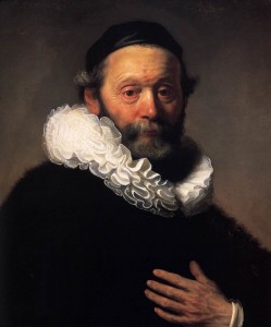
Orson Welles did not invent the technique, however. It is perhaps first seen in the work of the premiere portrait artist, Rembrandt.
The above painting of Johannes Wtenbogaert was made by Rembrandt in 1633. The subject appears to be looking slightly down at us. This perspective draws us straight to the eyes and tells us this is a figure of some importance. Without knowing anything about the subject we infer that he was at least comfortable in his own skin. This style of portrait, including the perspective and the way light falls in a triangle beneath the eye on the shadow side of the face, has been prominent in high-end photography for many generations.
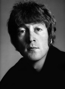
This picture of icon John Lennon was taken by the late photographer Richard Avedon, an icon in his own right, in 1967. Notice again the perspective. Lennon’s chin is up but his eyes are looking slightly down at the camera – at us. Notice also the triangle of light under the eye on the shadow side of the face. If it’s good enough for Rembrandt, Avedon, and Lennon, it’s good enough for me.
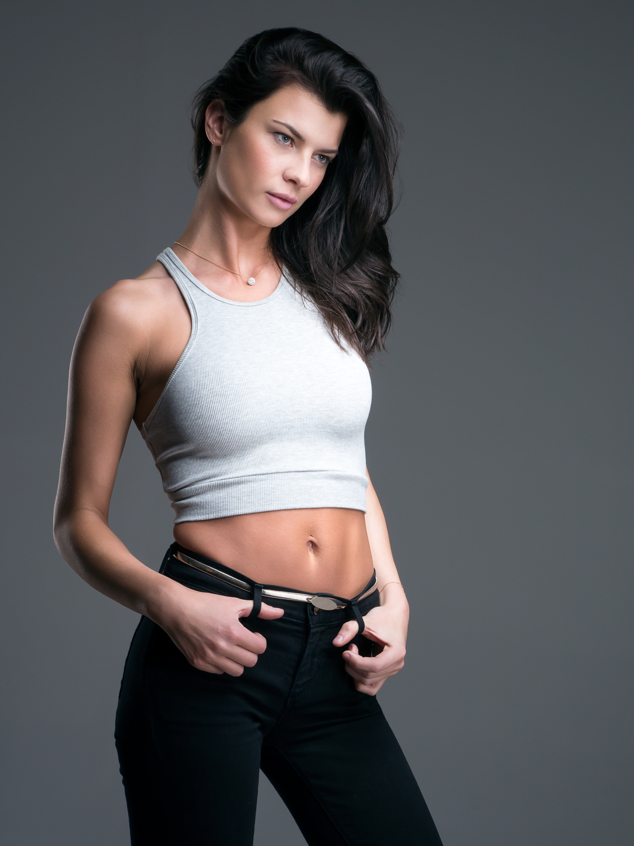
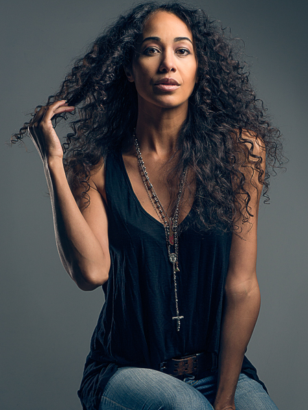
This is a photograph I recently took of a talented actress here in Los Angeles. It is nominated for an Exposure Award and will be on display at the world famous Louvre Museum throughout July, 2015. I employed the same principles of light and perspective as in the above pictures. Maybe one day I’ll reinvent the wheel but, for now, I’m happy to learn from the masters.
I don’t shoot every picture like this, of course, but for actors it’s one excellent choice for a powerful theatrical photo.
Now that you’re aware of the difference in perspective, and Rembrandt’s lighting, you will notice it wherever you might expect to see world class photography. Where you likely won’t see it is in most headshot photography.
Check back next week, July 6th, for the next installment of The 8 Biggest Mistakes. In the meantime, don’t let your photographer aim the camera down at you.
Copyright 2015 Christopher Violette
